![]() Texas State is far ahead of the game when it comes to managing its websites. Over 350 university websites are managed through one central CMS, we affectionately call Gato. It’s such a success Magnolia even wrote about. When Gato was just a new punk kid on the block it was hip and cool. But then it got older. It began hiking its pants up a little too high; dropped a little too much hipster slang to fit in. It became dated. It was no longer cool.
Texas State is far ahead of the game when it comes to managing its websites. Over 350 university websites are managed through one central CMS, we affectionately call Gato. It’s such a success Magnolia even wrote about. When Gato was just a new punk kid on the block it was hip and cool. But then it got older. It began hiking its pants up a little too high; dropped a little too much hipster slang to fit in. It became dated. It was no longer cool.
Well, I’m out to fix that! ITS has partnered with University Marketing to give Gato that much needed visual and functional update in 2015. I’m giving it the full UX treatment and you can follow the progress here.
Why Now?
In short, a change in leadership. University Marketing’s Director retired and the new blood brought in was approachable. It was easy to demonstrate to someone with no links to the past web design weighing them down that the design was dated and had to be modernized. After 4-5 years of documenting the need, it was easy to make the argument. I struck while the iron was hot!
Ticket Review
My first course of action was to review any outstanding support tickets that might give us an idea of needed or requested updates. Functionally, there wasn’t much here. We’ve been addressing changes we could make within the Gato CMS without violating University Marketing’s template as much as we could. This included adding a floating Twitter feed and the featured paragraph type.
Focus Groups
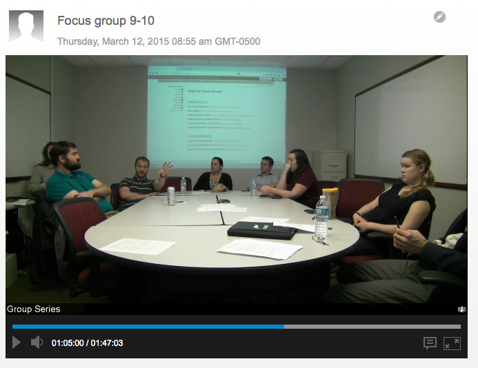
One of four focus groups viewing other university websites.
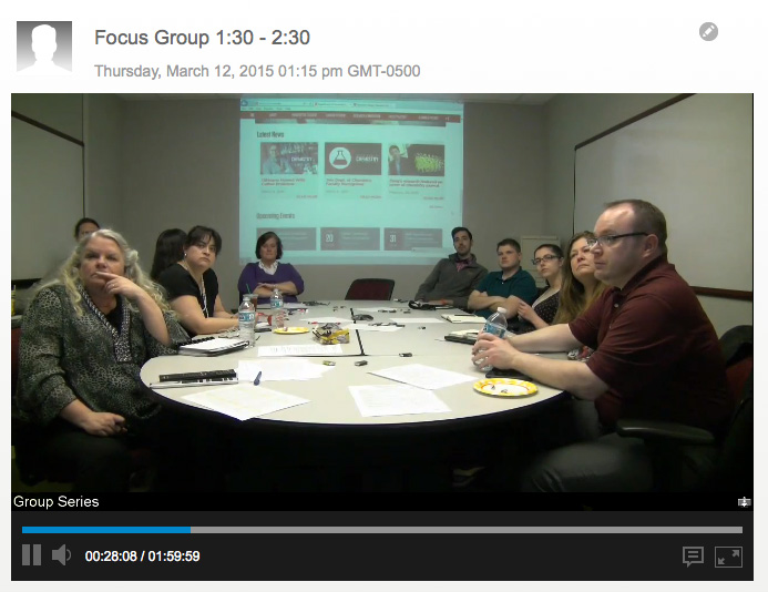
Focus groups were organized by their intended web audience.
Everyone likes to be heard. Within two weeks of the project approval I had arranged four one-hour focus groups. Gato users were invited to participate in one of four focus groups: College and Academic Department Websites, Service Department Websites, Student Serving Websites and Special Project Websites. I used the Texas State Signup Reservation System (which I help design and build) to allow first-come first-serve reservations. I set aside two spaces in each meeting for hand-selected participants chosen either by myself or University Marketing.
I chose a small meeting room which comfortably holds nine participants, two presenters and one note-taker. The focus groups were recorded via Bluejeans, for later note taking, and also broadcast to a teaching classroom for others on the project team to observe. All participants signed research consent forms.
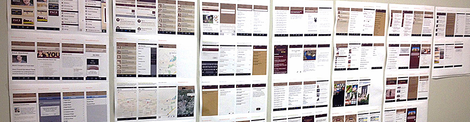
University Marketing selected a number of higher education websites that showcased modern web designs, layouts, navigation and information architecture. They also demonstrated some design work they have been doing within Gato and externally.
HIGHER EDUCATION
University of Nebraska: Chemistry, Libraries, Human Resources
Bates College: Visual Arts, President, Financial Services
University of Nevada, Reno: Graduate School, Budget Office, College of Liberal Arts
Berkeley University – Natural Sciences: http://nature.berkeley.edu/
University of Michigan – Admissions: http://admissions.umich.edu/
University of Chicago – Safety & Security: http://safety-security.uchicago.edu/
STUFF I’M WORKING ON
University Marketing website: http://www.umarketing.txstate.edu/
Discover website (Office of the President): http://www.txstate.edu/discover
Super early designs I’m playing around with: Template #1 | Template #2
Feedback for the groups was very positive. In summary:
Like:
- Grid based layout (content location flexibility)
- Modern look
- Use of feature sliders
- Collapsible menus
- Persistent top navigation
- Responsive across screen size (desktop, tablet, mobile friendly)
- Large image areas on background
- Use of buttons/icon sets
- Large Marketing footer
- Use of right-hand navigation
- New web font choices/Typography
- Image heavy sites
- Strategic use of background video
- Info graphics
- Use of secondary colors
- Text over image overlays
- Seperate popular links/quick links section
- Mobile quick links
- More action shots from University for Marketing
- More professional video
Dislike:
- Fullpage dropdown menu
- Large (marketing) footer for everyone
- U of N Chemistry too frenetic/too image heavy
- Background video
Feedback on the focus group process was positive:
- I appreciated being included in the process of the website template re-design options. I felt the instructors were listening to those of us in the workshop and were generally happy with the feedback that we provided.
- There was a lot of really good discussion which actually felt productive towards our ultimate goals. The mockups and other University sites were also very helpful so we could see what direction we were taking in the future. This gives us an idea in advance of what things make look like so we can plan for future site changes.
- I liked that the university is looking for user recommendations for change.
- Seeing so many examples, especially the stuff Michael is currently working on.
- The fact you are asking different departments what their needs are and what they would like to see in an update template is the best possible choice instead of just forcing something on us.
- Before I attended the workshop, I didn’t see the need to update the look of Texas State’s website, but after listening to the presenters and seeing other university websites, I can definitely see that ours needs to be updated.
- That we were all able to have an open discussion and realize a lot of departments were on the same page as KTSW.
- I loved seeing the new possible templates, and am excited to see them implements. I think it will fit better with our page.
- The instructors were knowledgeable and were very thorough with their presentation. The time allotted was good.
- Everything seemed very well planned, paced, and laid out for us. I’d love to hear from the instructors a time estimate on the new layout of the website rolling out.
- Everyone was very eloquent and impressive. I loved how receptive the process was.
Finalizing Designs and Paragraph Types
We’ve been finalizing designs, new and modified paragraph types in a rapid 6 week push. Feedback was gathered from Gato users via email and verbally. Always see “Current” version for the latest comps.
Designs Have Moved to Programmers! Level up!
We met our June 30 deadline and were able to generate a series of programming tickets for the Gato programming team!
Features will include:
- Updated header design with large image/banner area.
- Updated main navigation (sticky navigation).
- Updated secondary navigation.
- New universal footer with site contact information.
- 1, 2, 3, or 4 column layout.
- Responsive design.
- Button Paragraph.
- Updated featured/slider paragraph
- Updated calendar paragraph.
- Updated mobile responsive layout.
Some features will continue to be updated as we move forward in the programming phase.