After a severe weather closure there was a perception that the emergency notice posted on the Texas State University homepage was not effective in getting the message out. I was asked to make a comparison to the university up the road in Austin by the VP of IT. I expanded the comparison to encompass the major central Texas colleges.
The February 7th, 2014 weather closure was examined both on traditional desktop web browsers and a mobile device (iPhone 4).
Six universities had posted emergency weather alerts: Texas State University, The University of Texas, Huston-Tillotson University, St. Edwards University, Concordia University, and Austin Community College.
The emergency notices were examined for five attributes that contribute to visibility, accessibility and usability:
- Font Size: Used a larger font size for increased visibility.
- Color: Used either font or background color for increased visibility.
- Scrolling: Used a scrolling marquee. Not recommended for usability.
- Responsive: Website recognized and adjusted its layout for mobile devices to increase usability.
- Central or Top Location: Announcement had a prominent top or central location for increased visibility.
A summary of their emergency notices is below:
| Attribute | Font Size | Color | Scrolling | Responsive | Central or Top |
| Texas State University | Yes | No | No | Homepage:No Subpage: Yes |
Yes |
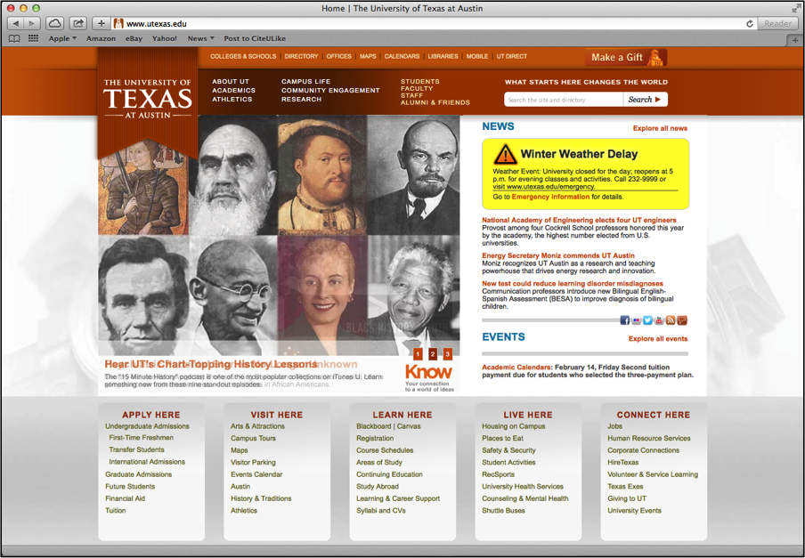
| University of Texas | Yes | Yes | No | No | Yes |
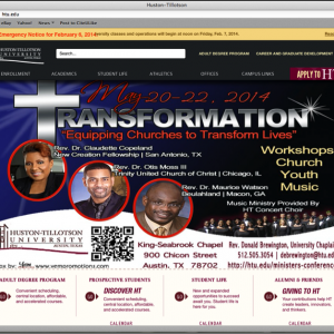
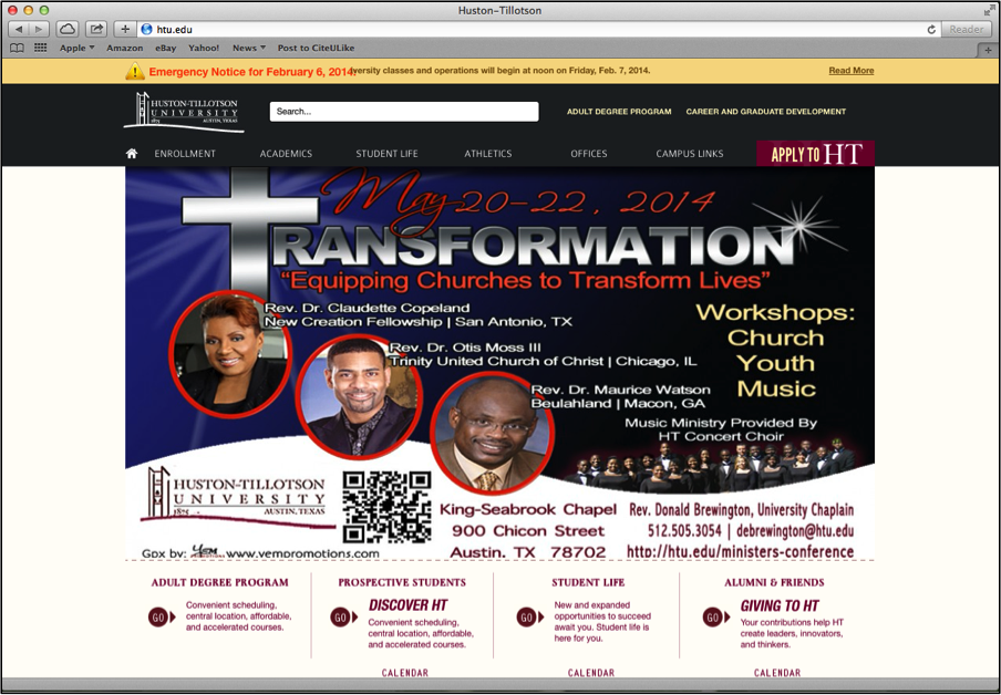
| Huston-Tillotson | Yes | Yes | Yes | No | Yes |
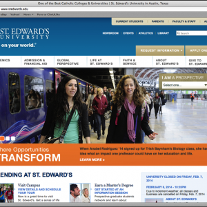
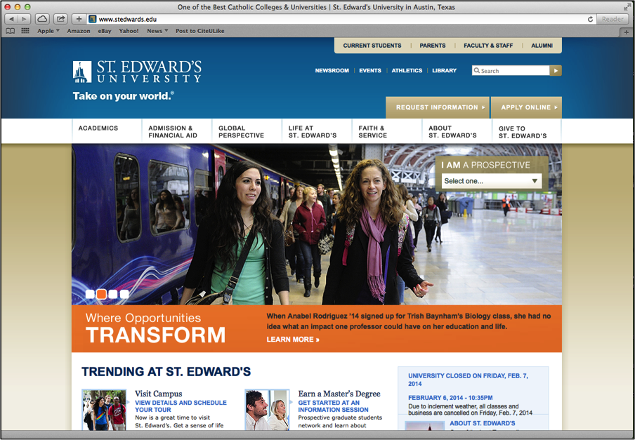
| St. Edwards | No | No | No | No | No |
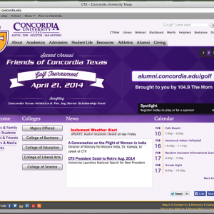
| Concordia | Yes | Yes | No | No | No |
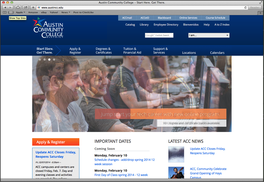
| Austin Community College | No | No | No | Yes | No |
Observations
- There was no consensus on displaying emergency information on the university homepage.
- Only ACC and St. Edwards had notices that did not stand out or were hard to identify.
- Color was used effectively by Texas, Huston-Tillotson and Concordia.
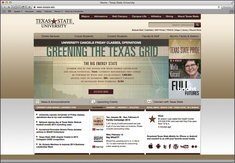
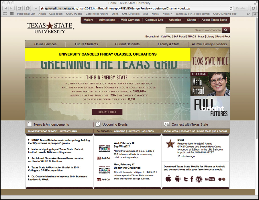
- Texas State’s announcement was centered, top and bolded but did not have color which limits its visibility.
- On mobile devices, only ACC had a responsive homepage design, but their navigation pushed the announcement below the fold negating benefits of the design and users had to scroll to see it.
- Only Texas State and ACC had sub-pages (the emergency notice details page) that were easily legible on mobile devices without zooming. Sub-pages at Texas State have a responsive design.
-
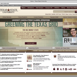
- Texas State University
-
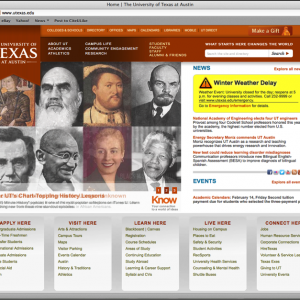
- University of Texas
-
- Austin Community College
-
- Concordia

-
- St. Edwards
-
- Huston Tillotson
Mobile Experience
As a significant percentage of the university web traffic is now on a mobile device (anywhere from 20% to 50% depending upon a number of factors) I also researched the announcements via my iPhone 4. I recorded the testing using Majitest, a great UX tool which captures the user’s voice, front facing camera and actions they take on the screen.
On the Texas State homepage video you can listen for the heavy sigh at about 30 seconds in as I click on the wrong link for the second time trying to choose on the announcement. If anyone doubts how bad the experience was on mobile, all they need do is watch the video. Google Analytics tells me 6,690 others had the exact same experience I did that day. And that doesn’t take in to account the Samsungs, LGs, Google Nexuses, Motoloras or HTCs.
You can also see my 60 second experiences with Austin Community College, University of Texas, Concordia, and Huston Tillotson.
Recommendations
I recommended that Texas State immediately improve the visibility of its emergency alert on the homepage by adopting the best practices i observed on the other university home pages: employing a bright color in the background, increasing the background padding, removing any transparency effects, increasing the font size, increasing the contrast and making the entire announcement area a link. All of these improvements could be accomplished with a simple CSS change. I coded up a quick demo of my recommendations. Long term, the page should be designed and coded to be responsive and recognize mobile devices. This will require a more significant design, usability, and coding effort.
After the report was delivered I was allowed to implement all of my recommendations immediately.
I coded up a quick demo of my recommendations.